
What...
Ooyala is an intelligent cloud-based platform for your video business. Offering services and solutions such as; Streaming video CMS; Ad Monetization; Player builder; Analytics; Live Streaming; and more.
Why...
Ooyala primary focus is to offer a suite of tools and solutions for streaming content creators/providers with customization, efficiency, and flexibility in mind.
How...
Our customers all have different needs and work flows. Keeping this in mind when designing is very important. We needed to create something that offers flexibility and efficiency no matter their work flow. Allowing for customization and an adaptable work space is how we are aiming to achieve this. Working in an agile process gives us time for research, customer feedback, iterating on wireframes and interactions before doing visual design and shipping the product.
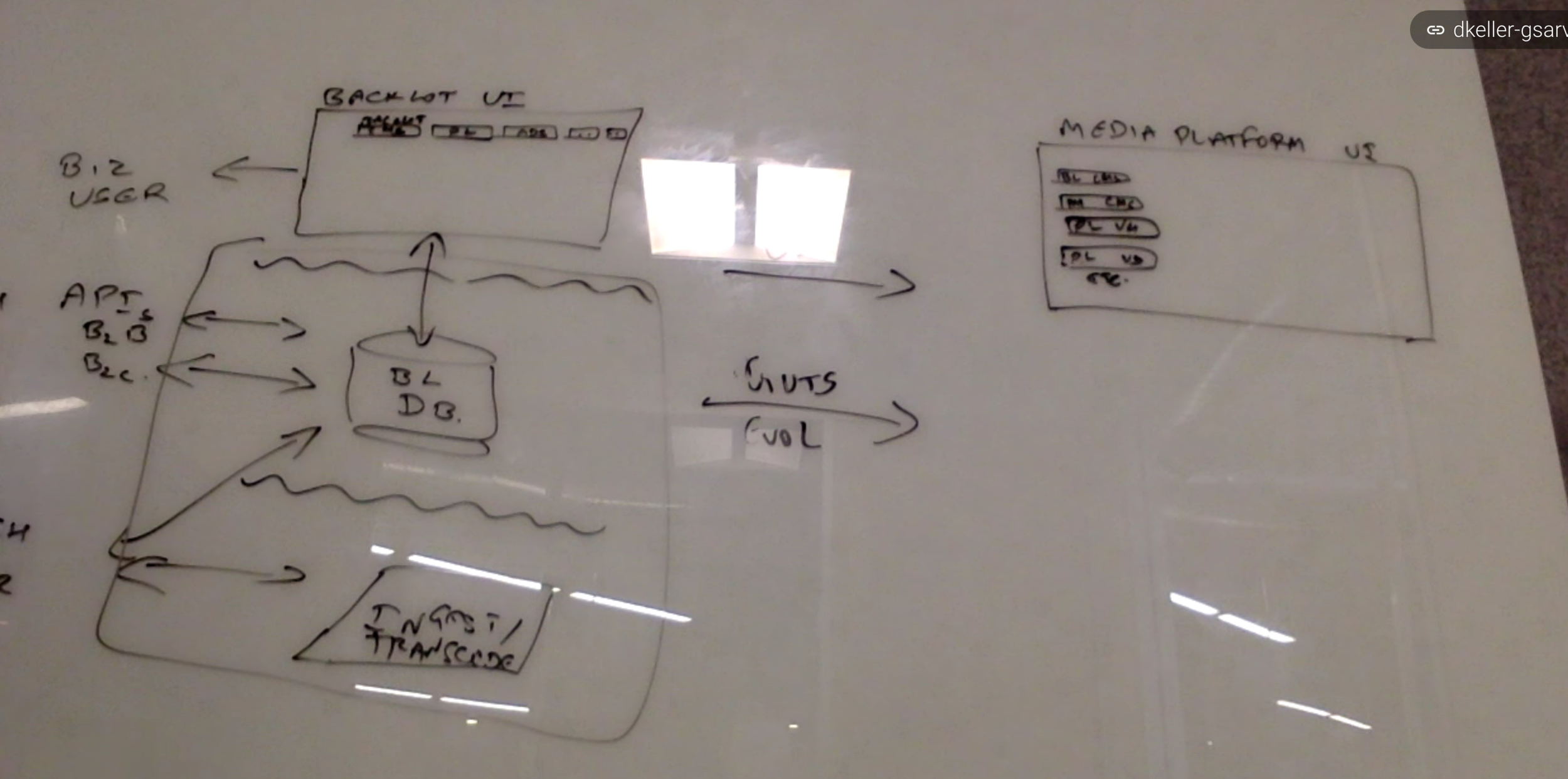
Exploration, White-boarding and Information Architecture...
After discussing the product requirements with the Product Manager we'd work up user stories and based off those start exploration, white-boarding and IA.


Customer Feedback
Something that we push for often is customer sessions where we can ask who, what, when, where, and why questions relating to their work flow, gaps in the work flow, pain points, etc.
Wire-framing...
Based on the customer feedback and our research we'd start working on wire-frames and prototypes to try and reach a solution for our customers.


Program Manager
One of my main projects has been working on updating Program Manager, our CMS. My sprint zero for this project has so far lasted 3 months - consisting of a lot of exploration, wire-framing, information architecture, persona building, customer feedback and prototype building. In one instance of customer feedback we actually had a couple content management executives fly in from Australia for a week long session...


In it's current iteration Program Manager is pretty outdated in terms of UI/UX. Our customers found it difficult to navigate and find the content they were looking for. Program Manager doesn't provide a lot of information for it's content. In this screenshot you can only see 7 content groups. They also found a lot of redundant steps to add and change offers (special deals relating to live events, VOD, subscription, and purchase). Through my own exploration of the current iteration a lot of these pain points I had already started to address in my wire-frames and work flows.
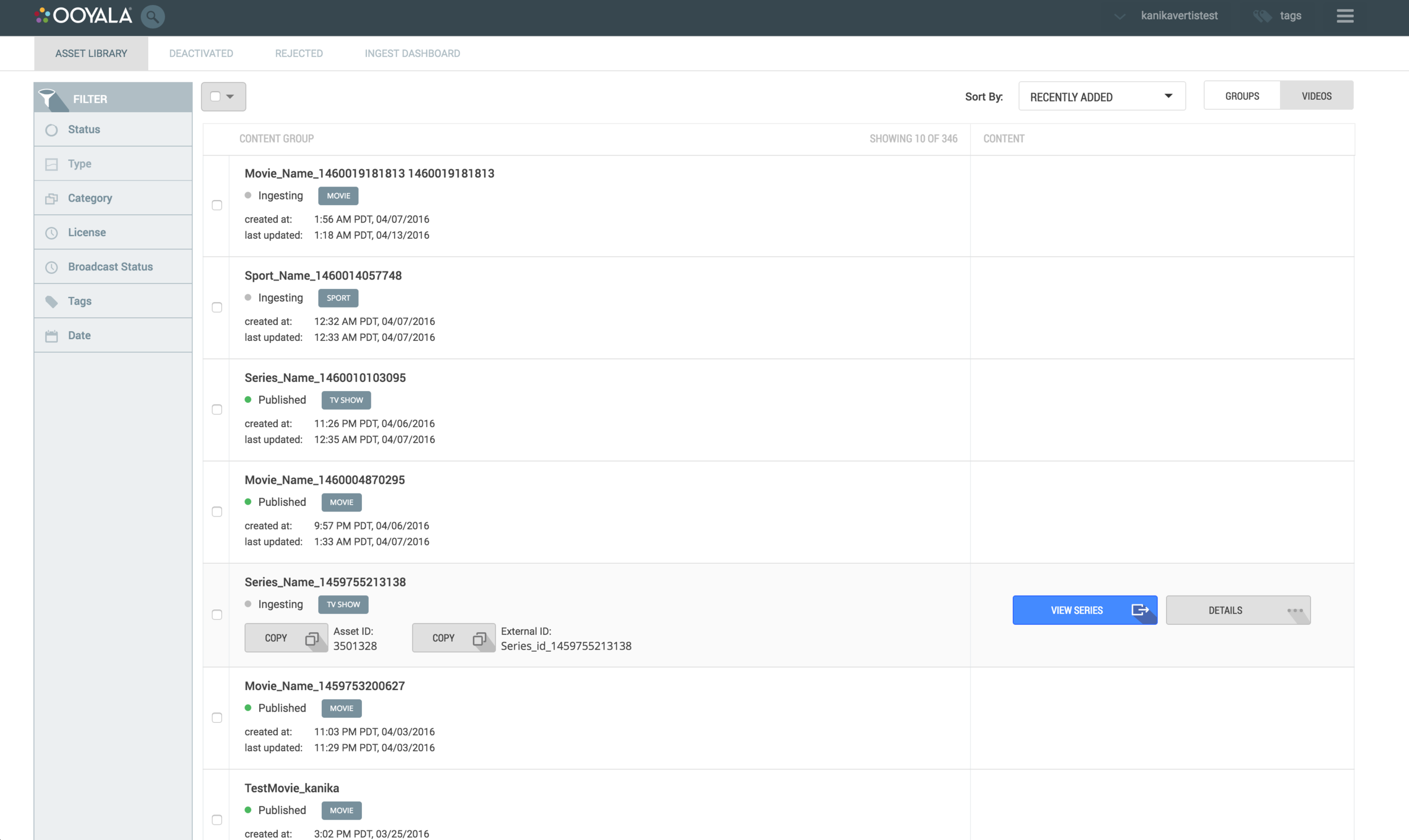

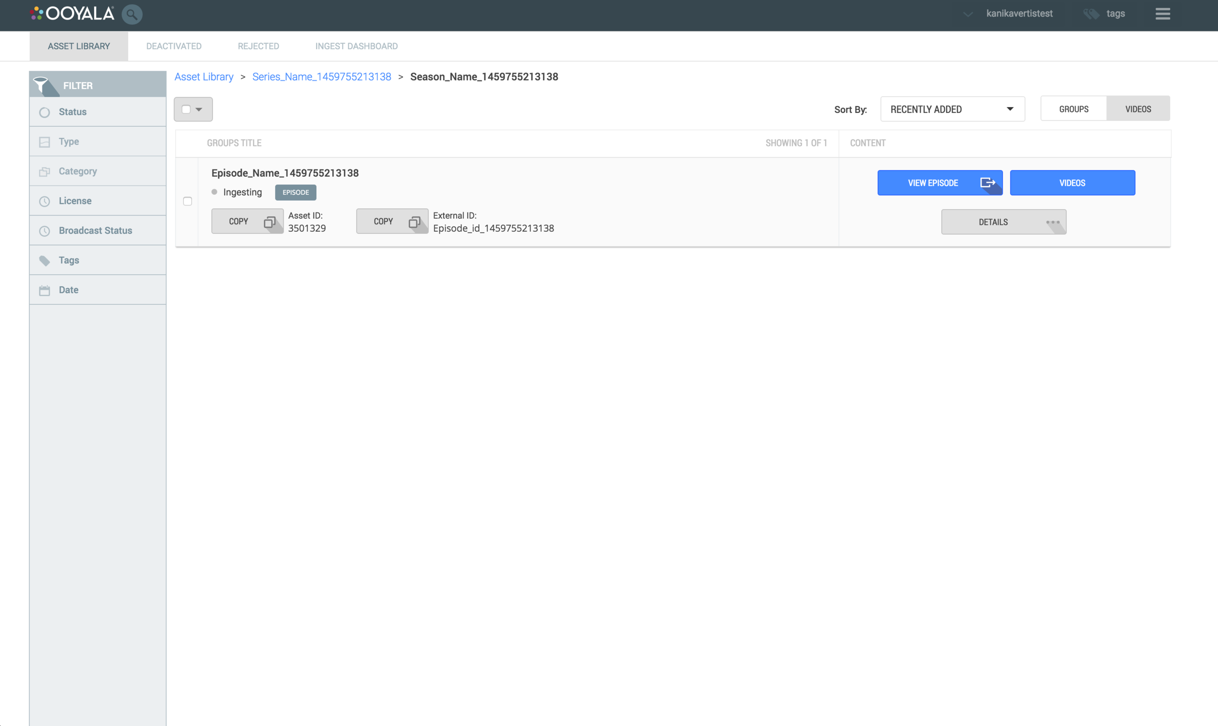
As I mentioned above, navigation was an issue for a lot of customers. Program Manager makes it really difficult to find a specific episode of a specific season of a specific series.


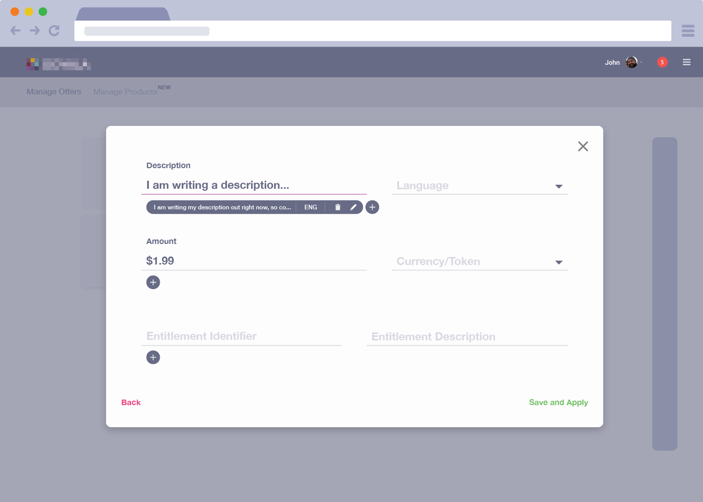
Offers are something that are very important to our users. They need to be able to add these quickly and efficiently. Program Manager doesn't do this in it's current form.You'd assume you'd be able to go into a Content Group you wished to add an offer to and create/add the new offer. That wasn't the case. You had to go into Offer Management, create a new offer, go back into the asset library and find the content group, open the details page, open Offer Management, and finally browse for the newly created offer to add.
Customer Feedback and Iteration...
After our first rounds of customer feedback sessions we'd iterate on our designs to fill gaps in the work flow and address the pain points. After which we'd meet with customers again to see if our solutions met their needs.
Visual Design... And More Customer Feedback
Once a more interactive/visual prototype was ready (typically using Invision) we sent out the link to have them leave feedback on. We followed up with a phone/WebEx session.

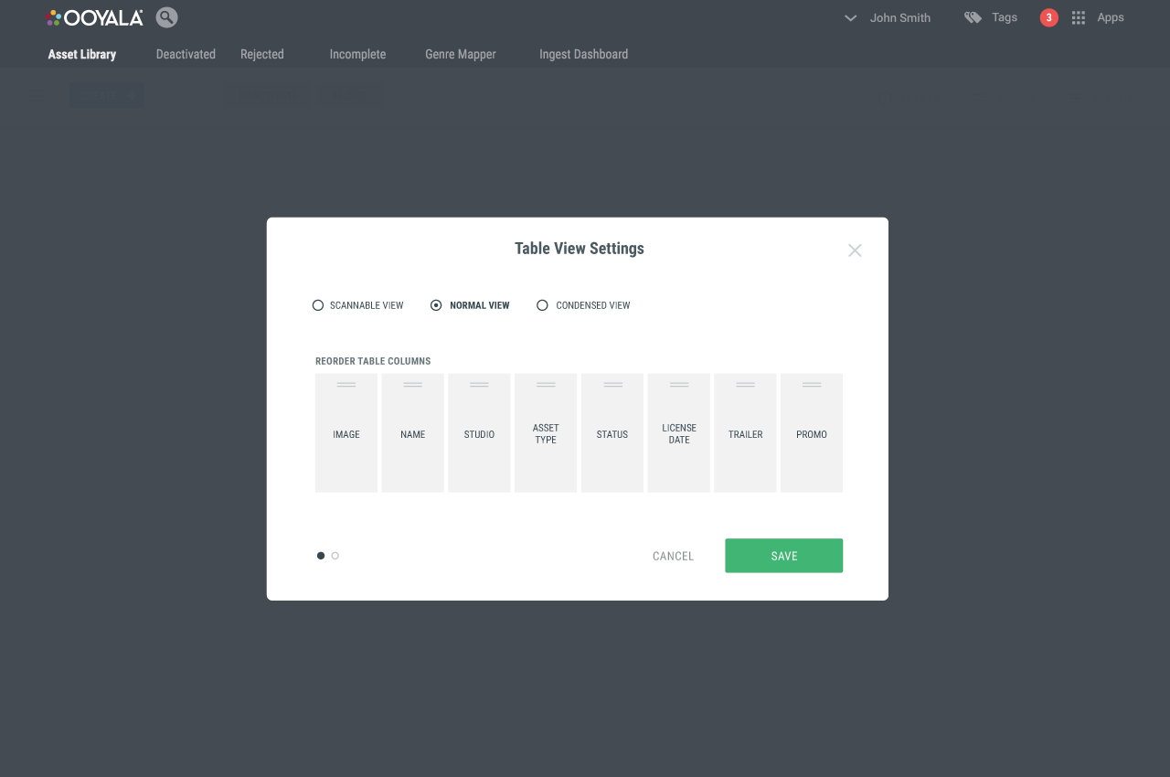


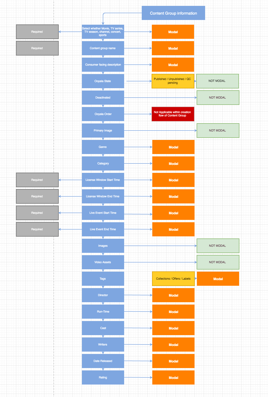
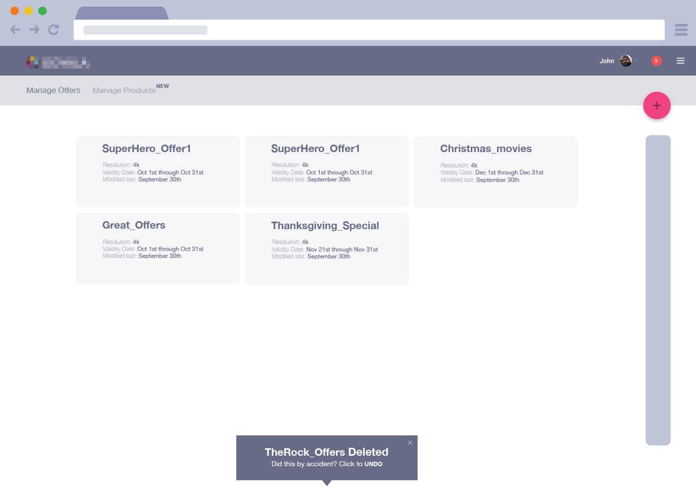
To solve the problem of not seeing enough/or the right information I came up with flexible table settings. The user can select what information they wish to see and how the table is displayed.


To solve the problem of navigation through content groups I came up with "Fast Navigation." A quick slide-through style dropdown which can be accessed from any point of the app.


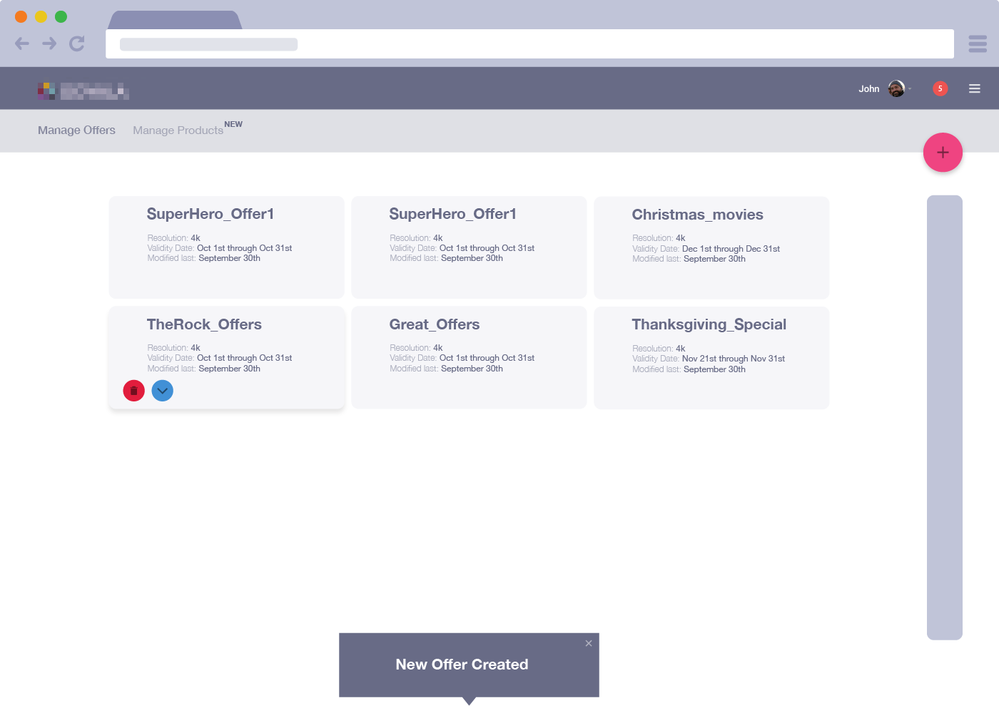
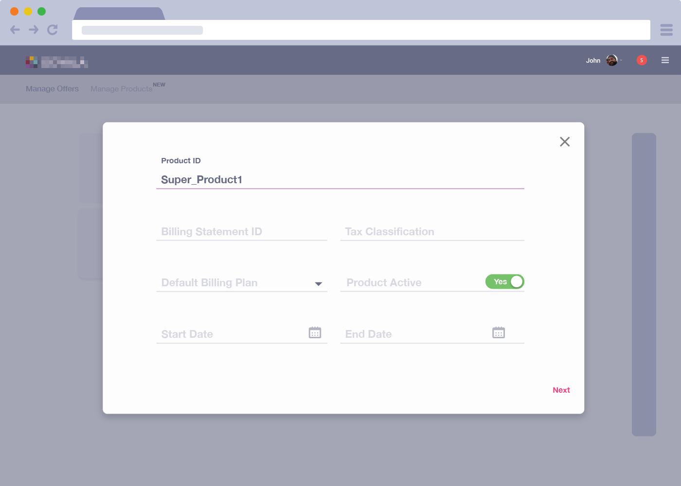
And finally, their biggest pain point, a solution to the inefficient work flow for adding offers. Offers could now be created on the fly from any app you were in using a quick create from the dropdown app menu. I also got rid of all the tabs, and tabs within tabs to create a more flat level navigation within the content group details page. A user simply had to click Offers and "add offers" to create or browse existing.